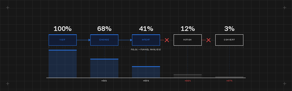
Why My Website Isn't Converting
(And It's Not Your Design)
Why my website isn't converting? Well a beautiful website should help your business. But beauty alone does not build trust.
That is where many businesses get misled. They invest in a cleaner layout, stronger imagery, better typography, and a more polished visual style — then wonder why the site still feels flat.
The problem is not always the quality of the design. The problem is that visual polish is often mistaken for credibility.
A website can look expensive and still feel uncertain. It can look modern and still feel generic. It can look well designed and still fail to communicate authority.
That happens when branding, structure, messaging, and user experience are not aligned. And when those elements are out of sync, trust starts leaking immediately.
Why trust is not a design style.
Trust is not created by minimal layouts, elegant fonts, or motion alone. Those things can support trust, but they do not create it on their own.
Trust is built when every part of the website reinforces the same message:
- This business knows who it is.
- This business understands what it does.
- This business is clear about who it serves.
- This business operates at a level worth paying for.
If the visual identity says premium but the messaging is vague, trust drops. If the branding feels refined but the structure is confusing, trust drops. If the site looks strong but the user has to work too hard to understand the offer, trust drops.
That is the part most web studios miss. They improve the surface without fixing the perception.
The real reason nice-looking websites still underperform
A website fails to build trust when it creates friction between what the business claims and what the experience communicates.
That friction usually shows up in four places.
1. The branding feels polished, but not distinctive
A website may look clean and current, but still feel interchangeable. People do not trust brands that feel borrowed. They trust businesses that look considered. If your site resembles ten others in your category, the market does not read that as safe. It reads it as replaceable.
Premium perception requires more than polish. It requires identity.
2. The messaging is broad, vague, or self-focused
This is one of the fastest ways to lose trust. A business might have strong work, strong results, and strong intent, but if the headline says almost nothing, the visitor is left to interpret the offer alone.
That creates uncertainty. Uncertainty kills trust. Clear messaging does not need to be long. It needs to be sharp. People should understand what you do, who it is for, and why it matters within seconds.
3. The structure does not match buyer intent
A homepage should guide a decision. Too many sites present information in the wrong order. They lead with visuals before clarity. They bury proof. They skip over objections. They assume the visitor will connect the dots.
They will not. A trustworthy homepage reduces cognitive load. It anticipates what the visitor needs to believe before they take the next step. Good structure does not just organise content. It builds confidence.
4. The user experience creates subtle doubt
Trust is rarely lost because of one catastrophic issue. More often, it disappears through small signals: inconsistent spacing, weak hierarchy, cluttered sections, premature calls to action, broken mobile layouts, disconnected proof, or copy that sounds inflated.
Each issue may seem minor in isolation. Together, they change how the business feels. And trust is often a feeling before it becomes a decision.
Why this matters more for premium service businesses
If you sell expertise, trust is not optional. Your website is not just showing your work. It is representing your thinking.
For premium service businesses, the website shapes perception before a conversation ever happens. It affects whether you look established or early, precise or improvised, strategic or decorative.
If the website does not reflect the level you operate at, it quietly weakens pricing power, credibility, and conversion.
Many businesses assume the answer is a visual upgrade. Sometimes it is. But if a redesign does not address structure, messaging, and perception, the result is just a better-looking version of the same problem — praised for aesthetics, unchanged in performance.
Three things to check on your homepage right now
You do not need an audit to spot the warning signs. Look for these three things:
- Read your headline out loud. If you could swap it with a competitor and no one would notice, it is not doing enough. A strong headline is specific to you — your offer, your audience, your point of view.
- Count the seconds before proof appears. If a visitor has to scroll past three sections before they see a result, testimonial, or case study, your structure is making them work. Trust needs evidence early, not buried.
- Check your site on a phone you do not own. Not your own device. A family member’s, or a colleague’s. Fresh eyes on a smaller screen expose hierarchy problems, spacing inconsistencies, and navigation friction that familiarity hides.
If any of those three feel off, the issue is probably not beauty. It is trust.
Final thought
A beautiful website can win attention. But attention is not the same as confidence.
If your branding, structure, messaging, and UX do not reinforce each other, the site may still feel uncertain no matter how polished it looks.
That is where trust is won or lost. And that is why design alone is never enough.
Not sure where your homepage is losing trust?
A Pixel Haus homepage audit tells you exactly what is working, what is quietly undermining credibility, and what we would fix first.
No obligation. No vague feedback. Just a clear read on where your site stands — and what it would take to make it reflect the level you actually operate at.